Constructive Critique....

Talk about your experiences with models, equipment, locations and new work

Constructive Critique....

Postby kidteehello on Fri Sep 29, 2006 6:56 am

yea so I kinda missed the whole photographer Chat thing earlier but I found it so here ya go....

So we all love each other here right, well I think the best way to show someone you care is by telling someone in detail how they need to work on the skills or how awesome they are but, with more flair.
So post your photos so we can say stuff...

I know I do I am new so I thought it would be awsome to start a little Critque spot so that everyone can enjoy.

Some of the best things I have learned was from a really good critique.....

So if I figure out how this works there should be a photo below:

Image
kidteehello
 

Postby Lost Coast Photo on Fri Sep 29, 2006 7:20 am

First let me say that at that event where we met for about 23 seconds over the summer... I won't say more than that about exactly where that was to minimize bruised egos, but you know what I mean... I drove out there with a Wicked Talent model in the car, and another model who really wants to be a WT model and who you shot with... and we all went through the photographers and models attending and looked at portfolios a few days ahead of the event, and were... really disappointed. You were one of only three photographers who made my recommend list (both models asked me to look), and it was a very easy decision. That's all the more impressive because you beat out, in my opinion, folks who have been at it for 20 or 30 years.

I like your freshness and passion, things that do show in the final product but are hard to pin down.

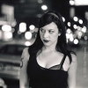
Specific to this image: I like the dynamic energy in the models position. It doesn't look posed, which means the two of you must have had a good flow going. I like the way the light catches the eyes. I like the simple, uncluttered background (too much clutter is one of the top three inexperienced photographer mistakes). The only negative I can see is that the light is a little contrasty, resulting in a loss of shadow detail in the hair and a couple of smaller areas of black. You just barely held onto the highlights, which many people would not have. Here you're up against the restricted dynamic range of digital, and you can always say guys like Greg Gorman and Andreas Bitesnich intentionally let the shadows go. Oh, and you got away with a difficult nose shadow by creating a highlight triangle on the cheek; two inches either way in your camera position or the models head angle, and the image wouldn't have worked. I'm curious, did you see that, or was it a lucky accident? Most of us have some of each.

The important thing is that the model looks alive, not like she wants to be somewhere else like so much of the glam junk I see online, and you didn't do anything to distract from that in a technical sense, despite a difficult lighting situation.
User avatar
Lost Coast Photo
Photographer
 
Posts: 52
Joined: Tue Sep 05, 2006 9:33 am
Location: Ferndale, CA

tehe

Postby kidteehello on Fri Sep 29, 2006 7:29 am

Wow I have never blushed so much at first I thought I disapointed you and then I was like Oh heh I am slow....


it was on purpose, I am all about the triangles sometimes I get it right sometimes I am way off but, this time I did just so happen to get it right....


I did it more contrasty on purpose I think I should drop it down a tad but I probably won't because I think it Pops more and if I make it less contrasty I feel it dulls the Image.....


Did I shoot the WT model? hehe seriously I can't figure out who it is?

Pm me her name :)


because I am slow
kidteehello
 

Postby Lost Coast Photo on Fri Sep 29, 2006 8:00 am

Yeah, you can't recover what's barely in the original image without losing the snap. Would have needed to reduce the contrast range in the original shoot with diffusion, a reflector, shooting early/late when the light wasn't as strong, greater distance from a window, etc. But sometimes you've got to grab the shot while you have the chance. That's one advantage I've got with b&w film, I can always overexpose to open up the shadows and then pull the development to rein in the highlights, basically compress the contrast range.

Sent you a PM with the other info.
User avatar
Lost Coast Photo
Photographer
 
Posts: 52
Joined: Tue Sep 05, 2006 9:33 am
Location: Ferndale, CA

hehe

Postby kidteehello on Fri Sep 29, 2006 9:04 am

I shot that with a flash... a sunpack flash


the same one I was luggin at the Group shot that gave me a big advantage because I should shoot anywhere with good lighting...

there about 260 and there very portable and versitle you can get so much with them....


thats all I use other than natural light
kidteehello
 

Postby Lost Coast Photo on Fri Sep 29, 2006 8:36 pm

You did a nice job of making it look natural then. Still a matter of either dialing down the intensity a bit, or getting a little bounce off a white wall or a reflecter, but probably harder to meter the balance that way.
User avatar
Lost Coast Photo
Photographer
 
Posts: 52
Joined: Tue Sep 05, 2006 9:33 am
Location: Ferndale, CA

yea

Postby kidteehello on Sun Oct 01, 2006 3:09 pm

I will probably bring it down a bit...
kidteehello
 

Postby Kassandra Leigh on Sun Oct 01, 2006 8:31 pm

*peeks her head over* i figured since i do some shooting myself maybe i could toss my 2 cents as well?

I realy adore the casualness of the image like was prior mentiond..it actualy reminds me of sliding off a couch all sultry like.So the feeling is definitly a good one.

As for the contrast(which seems to be the huge topic of discussion for it) i think it works for the image. Its rather stylish but if you could have brought the contrast down on her face--the shadow of her nose and the over exposness of her farhead i find to be distracting?
User avatar
Kassandra Leigh
Model
 
Posts: 59
Joined: Sun Aug 20, 2006 5:47 pm
Location: Farmingville, NY

hehe

Postby kidteehello on Sun Oct 01, 2006 10:50 pm

thanks and yea I can see that about the Forehead...... I may go back and try to fix it....

and repost

Kidtee
kidteehello
 

Postby falcona on Sun Oct 22, 2006 8:49 am

Her casual look is great, toying with the beaded necklace and throwing her other hand back to her hair. Her legs are pulled up but the light just captures her stocking top and garter, which ads an elemnet to the image that could have been lost, just as the important parts of the face could have been but aren't. The tile of the floor is again quite hidden but revealed in just the right place with just enough detail that you know its all there.
Shadows are a tricky thing to work with and succeed, I think you have succeeded nicely with this image. If I were to fault it for anything it would be the way the models mouth is gaped.

I'll post an image next that you can crit.
falcona


Return to Photographer Chat

Who is online

Users browsing this forum: No registered users and 3 guests

cron